Designing and Protyping Operating Room UI for Surgical Device
Role
Lead UX/UI, Prototyping, assisted research
Team
1 UX designer, 2 ID designers, 2 mechanical engineers, 1 human factors engineer
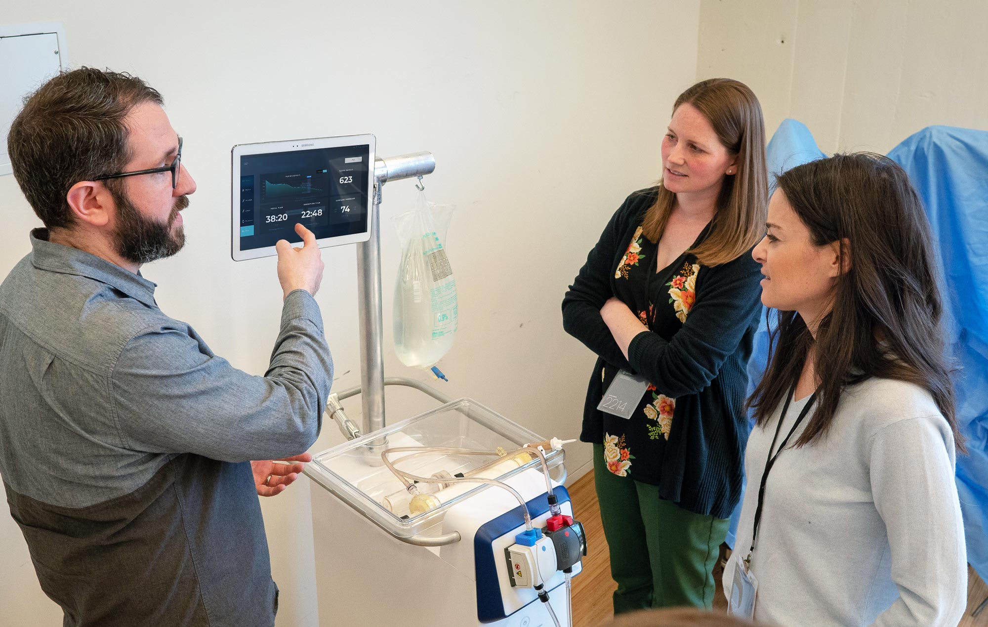
This project was focused on prototyping what the next generation of tissue removal system, from physical embodiment, UX/UI, and overall ergonomics. This was to serve as a proof of concept for our clients innovation team to then market and sell internally.
Our process
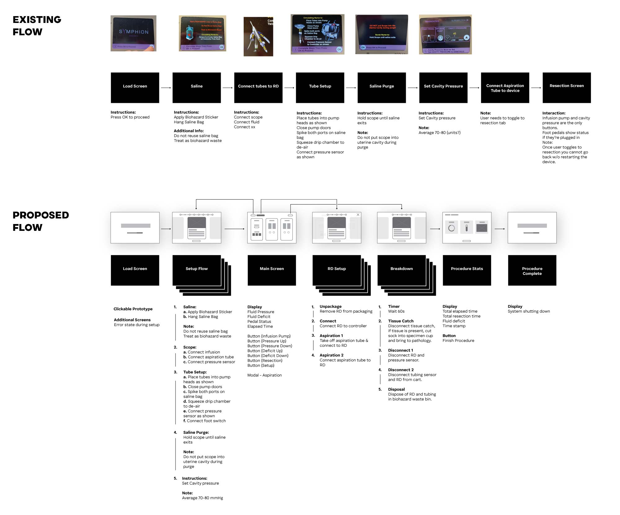
Evaulate the existing system, understanding it's strengths and weaknesses.
Speak with doctors, nurses and technicians who are using the existing system.
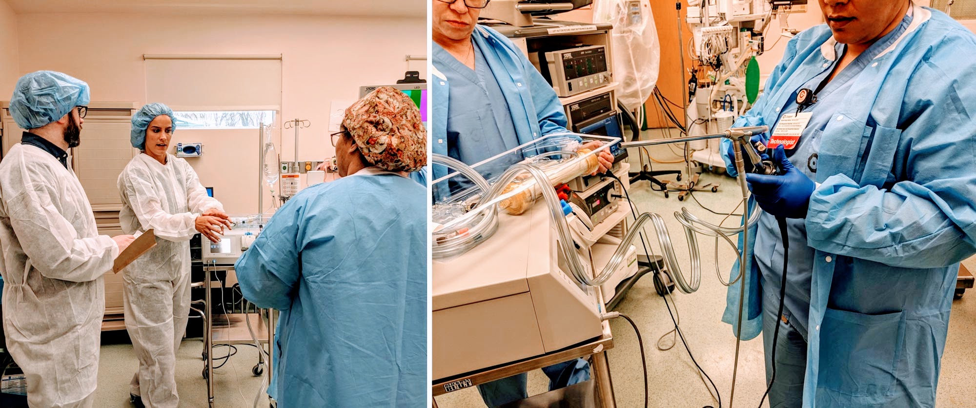
Shadow the surgical process live to understand how the system works live, under the pressures of the operating room.
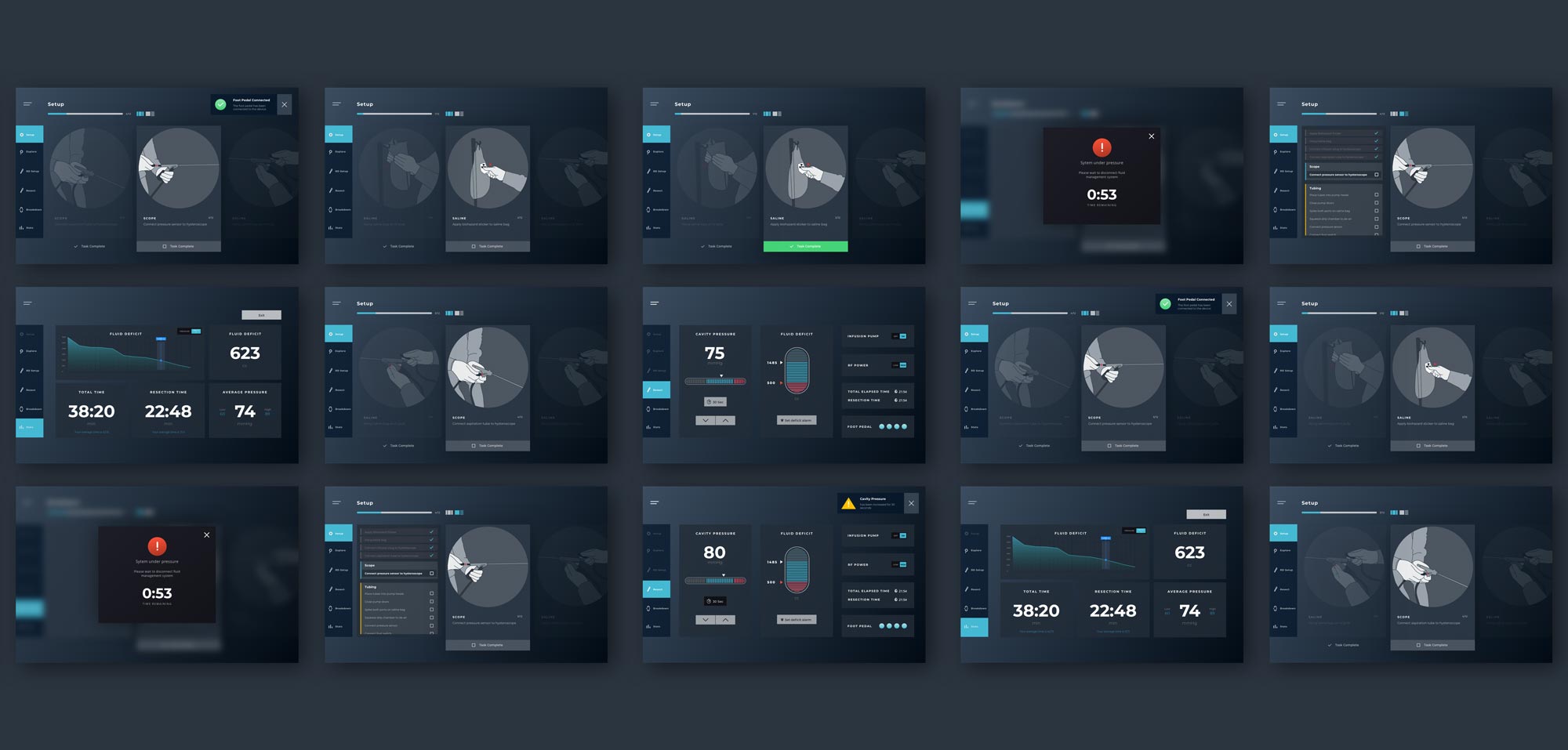
Propose and design and updated flow inclusive of setup, onboarding, fluid management, resection status, breakdown process, and medical stats on your procedures.
User Needs
Based on our research, we identified five opportunity areas to the overall experience.
01 / Informed Autonomy
How can we give the doctor the information they need, and the control to act on it within the sterile field, without relying on the circulating nurse?
02 / Frictionless Fluid Management System
How can we make the fluid management system setup and break-down intuitive and error-proof?
03 / Easy Ergonomics
How can we empower clinicians with comfortable and accurate interactions with the system?
04 / Interoperability
How do we enable the system to be compatible with more procedures?
05 / Tried & True
How can we increase clinicians’ confidence in the system by increasing reliability of components and minimizing fluid loss?


Stress Tests
Designing for real world scenarios
Our approach to the UI was make everything as usable and actionable within high stress environments, by using clear, legible text, critical activation states, make patterns quickly learnable and scalable so doctors and nurses don't need to think while opperating.
Increase situational awareness by giving doctors and nurses quick at a glance data for critical metrics such as how much fluid is left, and the rate of fluid loss.
Provide immediate control, nothing burried in sub menus.
Keep real world references in mind—the physical extentions of the UI through things like the foot pedals should be maintained.


