Redesigning the mobile ordering for McAlister's Deli
Role
Lead UX Design, Lead Qualitative Research, Assist UI Design
Team
2 designers, 1 product manager, 1 product owner, 2 dev leads
Additional stakeholders
Marketing, business operations, loyalty consultant, franchisees
The Problem
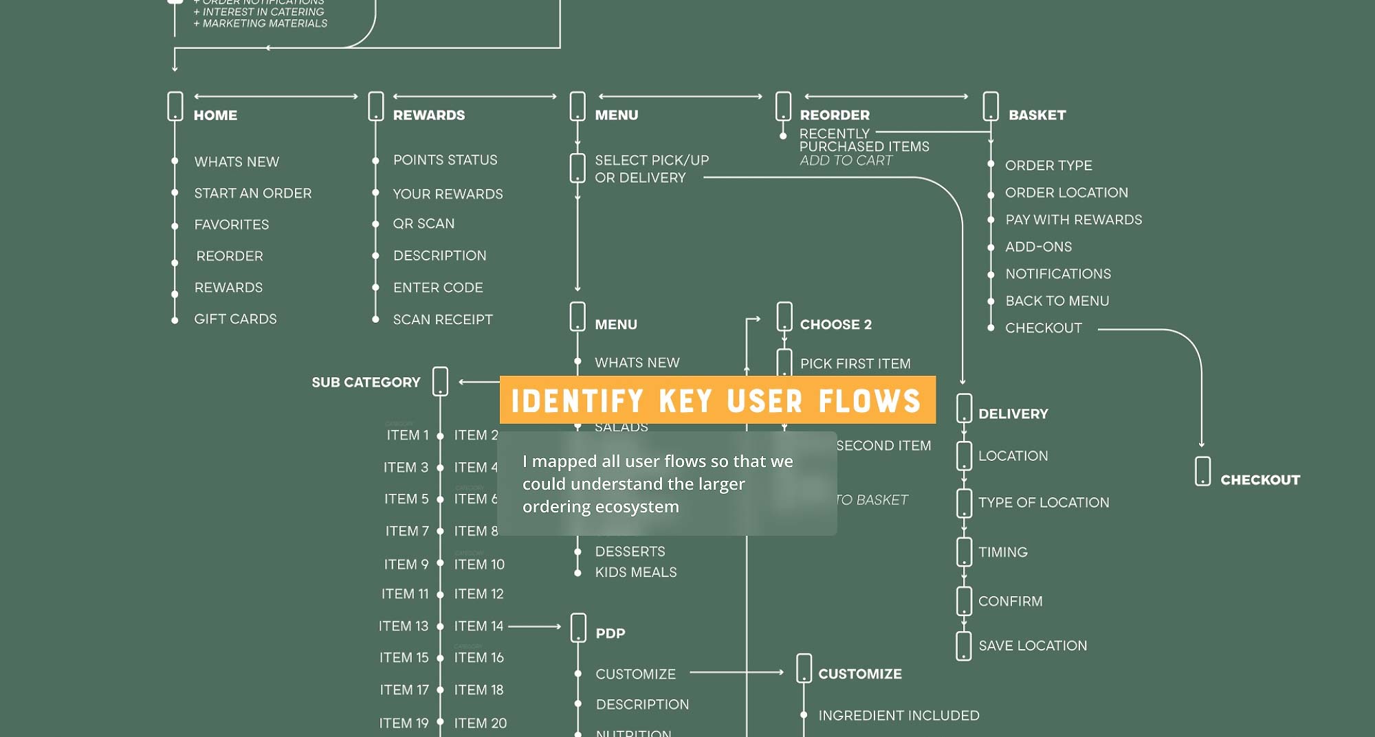
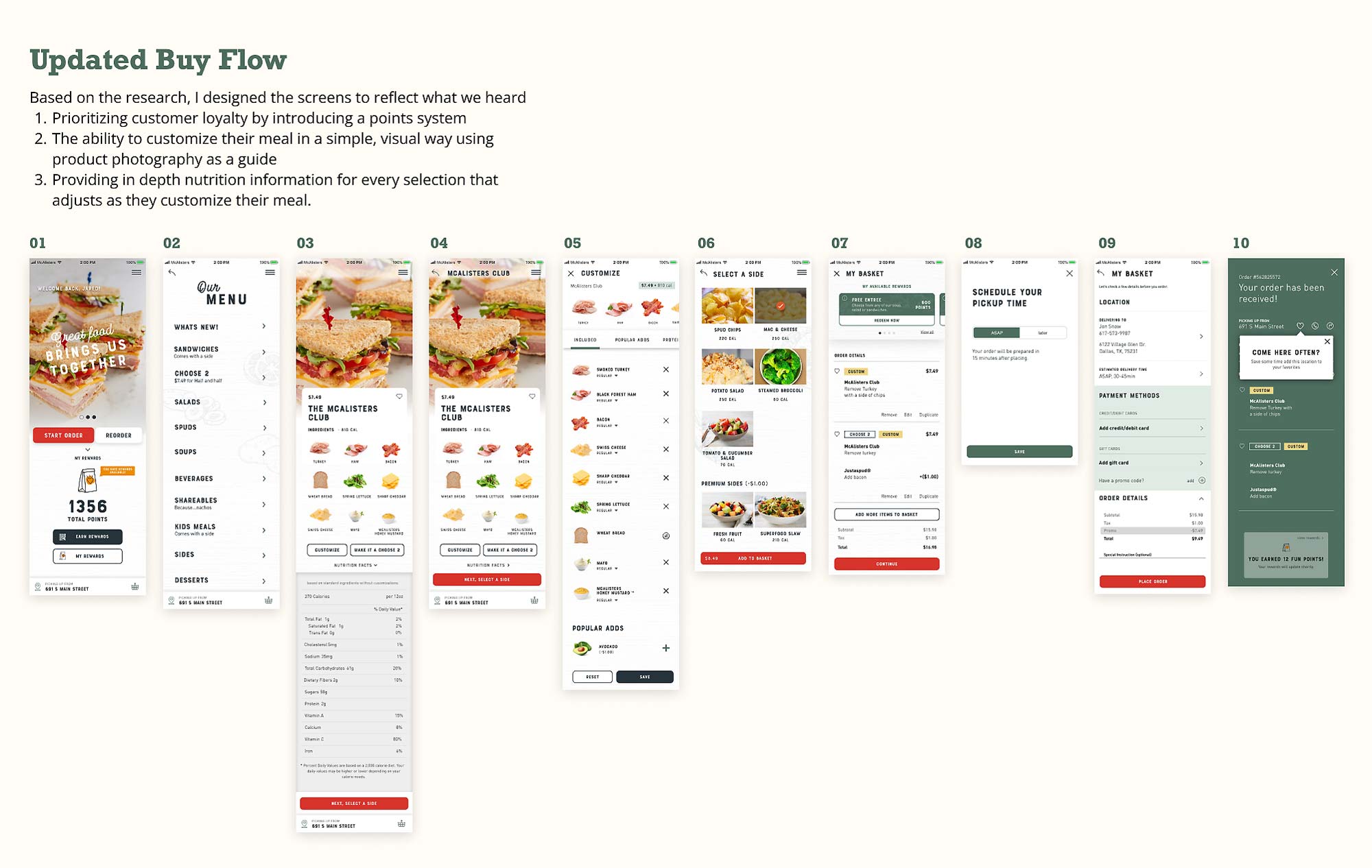
McAlister's is a beloved fast food deli that’s been around since the 80s with over 500 locations across 29 states. The main goals of this project were to update the mobile ordering experience since it omitted key parts of their in-store experience—being able to customize their orders, integrating their loyalty program, streamlining the overall ordering process and matching the voice and tone of McAlister's as a whole.
Research
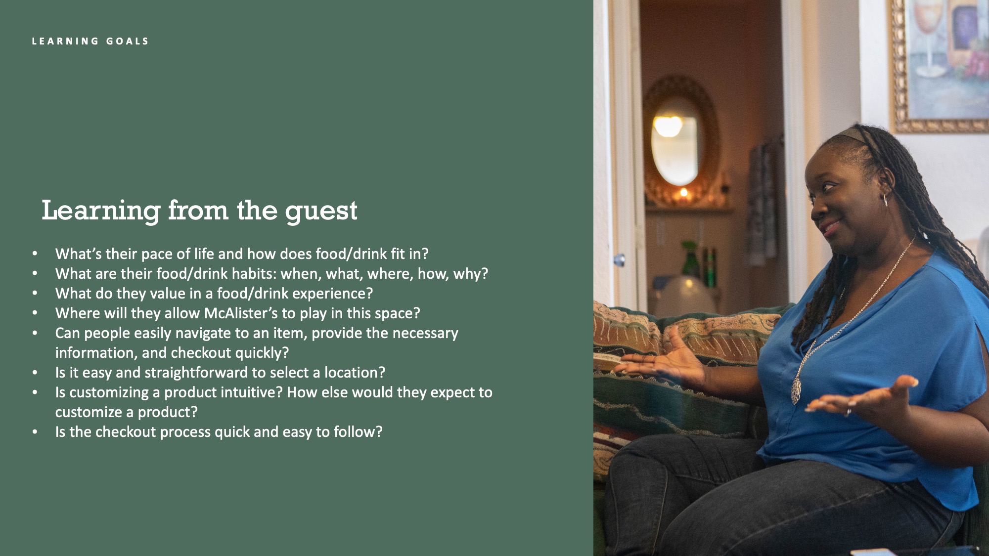
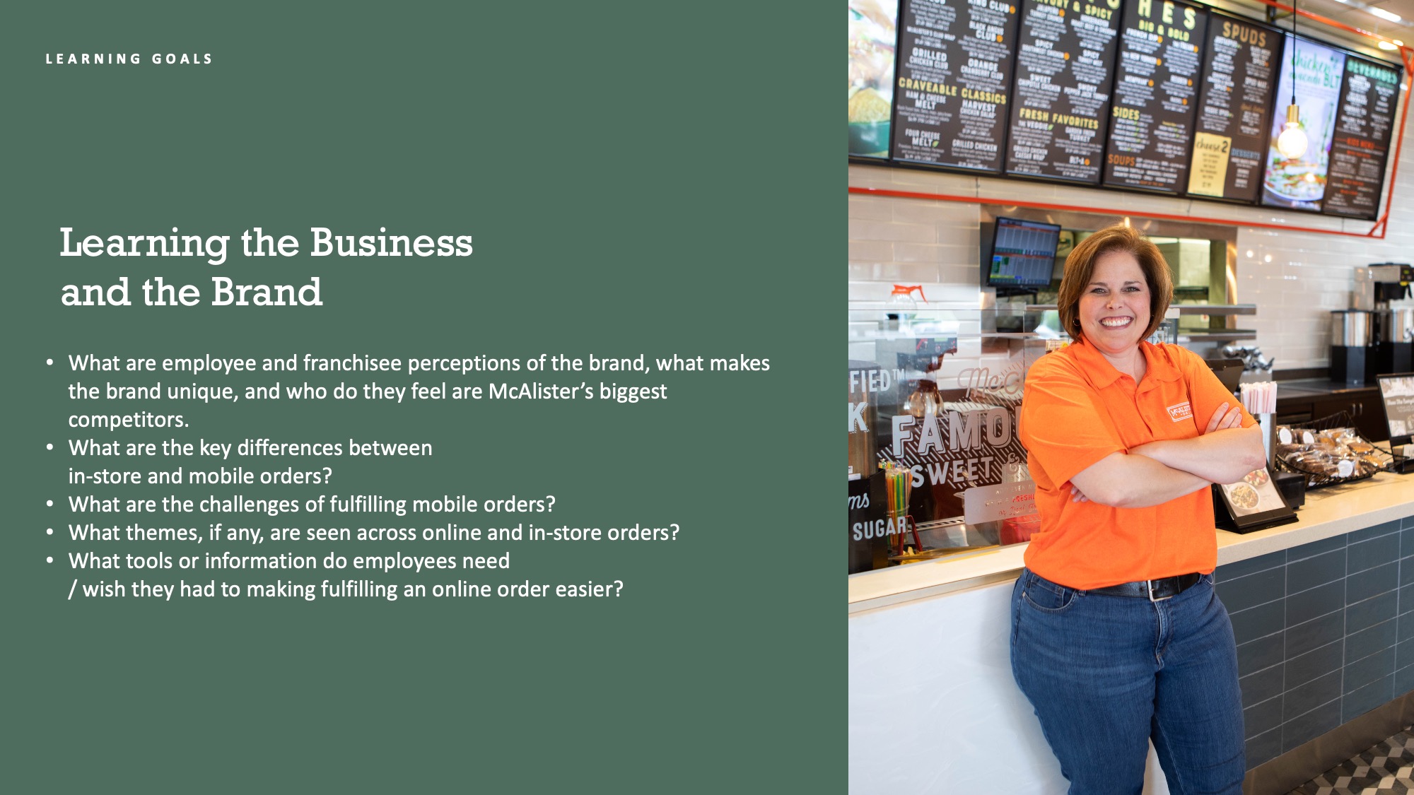
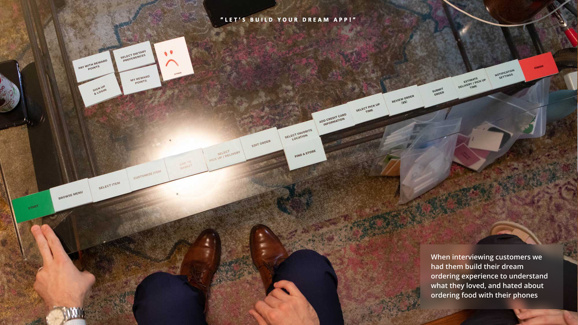
This was a six month project that started with understanding all stakeholders—the customers, the staff, the franchise owners and the marketing team.
The three biggest takeaways from research were:
Speed—customers very often grabbing food during lunch and wanted it as quick as possible;
Food transparency—people wanted to understand their macros to know their selection fit their lifestyle;
Minimize multitasking—customers were ok with the process being longer in terms of screens or clicks if it was simple and easy to follow.
Design
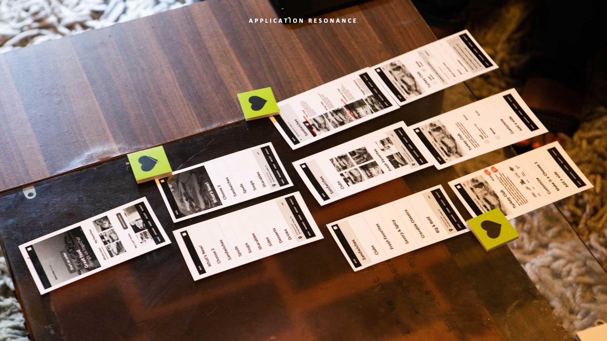
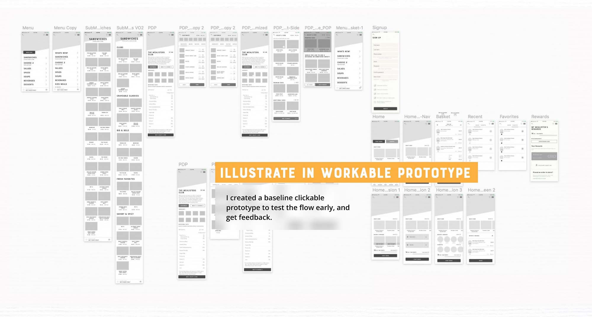
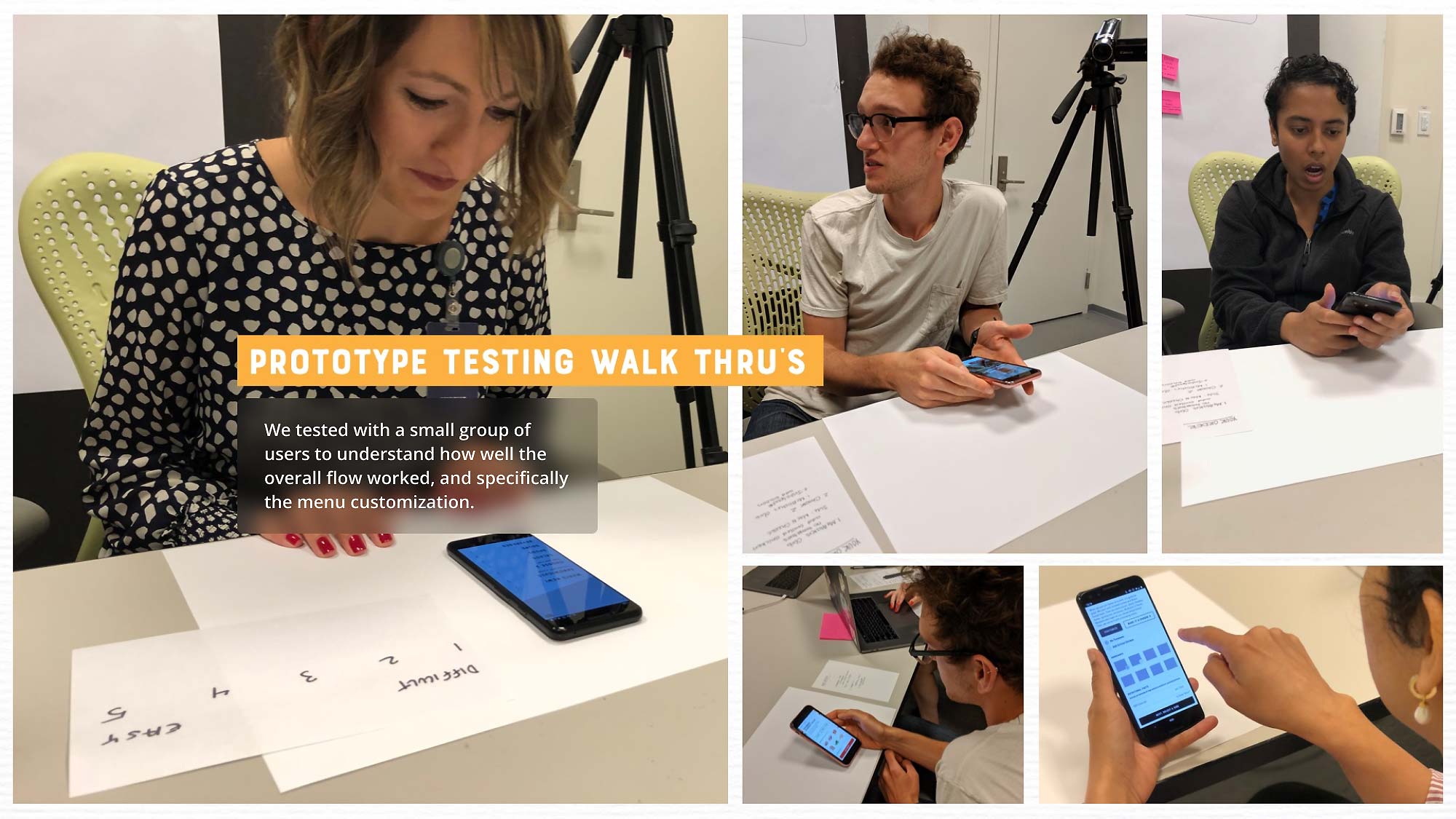
Our research lead to three different design languages that we tested with customers and presented to the client. Based on client and customer feedback we refined our design direction—ironed out all of the kinks and brought everything up to high fidelity.
Development
Dev was brought in early in the design process to understand the tech stack, and once we started finalizing the design directions we begin our daily checkins with the dev leads to help manage the dev handoff.


